

Role | Product Lead |
Timeline | July – August 2025 |
Context | UI/UX & Product Internship at CreativeMUT |
Platform | Mobile web, opened by QR code, with a large LED display |
Product Demo |
Context
During my internship at CreativeMUT, I worked on integrating technology into exhibition spaces and helping artists exhibit their work in cities across Asia and the United States.
One of the artists we worked with was G-Dragon, a Korean musician and artist who wanted to share his new art brand alongside his previous musical works. His exhibitions were designed to be interactive, using technology to build a more personal connection between visitors and his work.
In the first month of my internship, we helped ship and exhibit his works in Tokyo. The following month, we began planning the next exhibition in Osaka.
Problem
We needed to differentiate our Osaka exhibition from the Tokyo exhibition
Japan is well connected by public transportation like the high-speed Shinkansen, and many fans from across the country had already visited the Tokyo exhibition. We needed to differentiate the Osaka exhibition enough that Tokyo visitors would return, and Osaka locals would feel they weren't getting a lesser version.
An additional constraint emerged mid-planning: an LED screen near the exhibition exit needed a purpose.
We learned from previous engagement walls

Previous exhibitions had attempted visitor engagement walls, with mixed results.
Seoul installed iPads for digital submissions, but visitors couldn't save their work.
Hong Kong used a physical message wall, but it created no lasting connection between visitors and the artist.
We were designing for a new audience
The main UI/UX challenge was localization. I was used to designing products in English, for users familiar with American UI/UX trends and conventions. This product needed to be intuitive for Japanese visitors, and for an international audience more familiar with Asian UX conventions.
The interface also had to follow the design guidelines set for the entire exhibition, at the request of the artist's agency, so that the Message Wall felt like part of the exhibition rather than a separate product.
Process
I studied how apps and websites in Japan guide their users
I downloaded apps most used in Japan and noted any UX patterns that differed from the apps I was familiar with. I also looked at how Japanese websites organized information and guided users through a process.
I researched how visitors felt about the Tokyo exhibition
The Tokyo exhibition gained a lot of attention in Japan, so I used social media to understand visitors' impressions and pain points, and how the Message Wall could address them.
Visitors wanted to interact with the artist, even if indirectly.
Visitors valued the exhibition's freebies and souvenirs, expressing that they were useful for taking fun photos throughout the exhibition.
Japanese visitors shared their visits more actively on social media, compared to visitors in other cities.
These findings led us to treat the Message Wall as a photo spot as well as a creative space, and to let visitors keep a copy of what they made.
I surveyed and interviewed visitors before designing
An investigative survey showed that our visitors would mostly be in their 20s to 40s, with a preference for simpler interfaces. We also interviewed local Japanese visitors and employees familiar with the artist to shape the product's language. This led us to a more cordial, polite tone for instructions, along with English guidance for visitors from abroad.
I set three design principles
Intergenerational accessibility. With a wide age range and a preference for simpler interfaces, and with this being a new launch, the interface needed to be as intuitive as possible.
Brand cohesion. The Message Wall and its interface followed the exhibition's design guidelines, so that visual elements matched the rest of the exhibition.
Device consistency. Every visitor needed a stable, consistent experience, so we designed to reduce issues caused by different mobile devices and browsers.
Solution
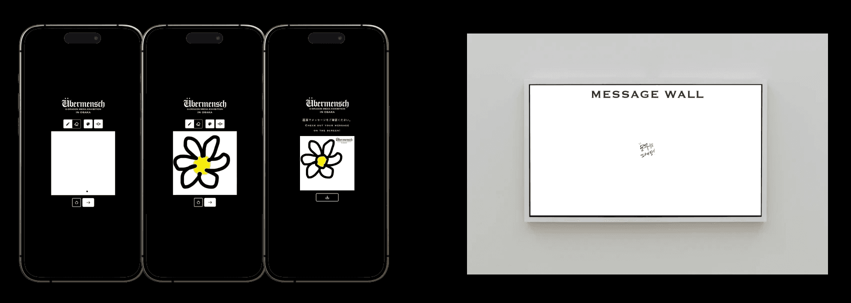
Building on what worked and what didn't in Seoul and Hong Kong, I pitched the Message Wall as an interactive version of the analog message walls found at exhibitions. Visitors draw or write a message on their own phones and submit it to the LED screen near the exit, giving that screen a purpose. Their drawings are celebrated on the screen for everyone to see, saved to their phones, and shared with the artist after the exhibition.
Two key product decisions
A branded save feature. Visitors had already shown how much they valued souvenirs and sharing their visit online. Saving each drawing with the exhibition branding made it a digital souvenir, and every shared drawing became organic promotion for the exhibition.
An artist archive. Visitors were told their messages would be sent to and seen by G-Dragon himself. Saving every submission for him to view personally turned a one-way fan experience into something reciprocal.
Product architecture

Printed signs framed the space as a Creative Zone
Following how on-site products in Japan guide their users, we kept on-screen instructions short and used printed signs to explain the concept. The signs framed the area as a "Creative Zone," where visitors became artists themselves, connecting with the artist through their own work.
Testing
We tested the Message Wall with 50 users, including on-site crew and Japanese locals across varied technical backgrounds.
Testing led to three changes:
Purposeful delay. We slowed down the drawing animations on the wall, so visitors had time to anticipate, prepare, and film their drawings appearing on the screen to share with others.
Icon placement and styling. Japanese users understood some icons differently than I expected, so much of the final icon placement and styling was decided based on their feedback.
Mobile-first fixes. Much of the testing during development had been done on computer screens. Testing on phones revealed bugs and transition issues that came with scaling, so we made sure the doodle interface adapted to all devices for a consistent experience.
Outcome

3.1K+ Social Media engagements related to the Message Wall
Visitors saved and shared their branded drawings online, extending the exhibition's reach beyond the venue. This fostered a more meaningful and organic promotion of the exhibition.
15% revisit rate from Tokyo exhibition visitors
Every drawing was archived for G-Dragon and his agency, so visitors' messages could reach the artist after the exhibition ended. This helped contribute to revisit rates, as visitors were more interested in being part of this new connection with the artist himself.
2K Visitors per session, on average
The LED screen gathered crowds near the exit, with visitors watching and celebrating each new drawing as it appeared.